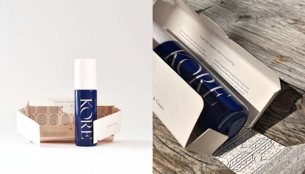
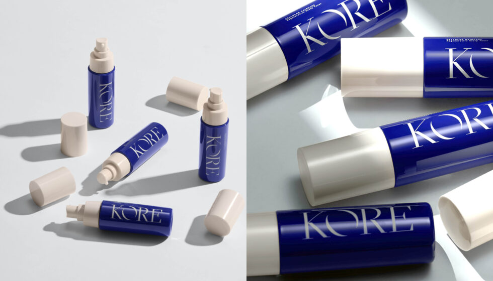
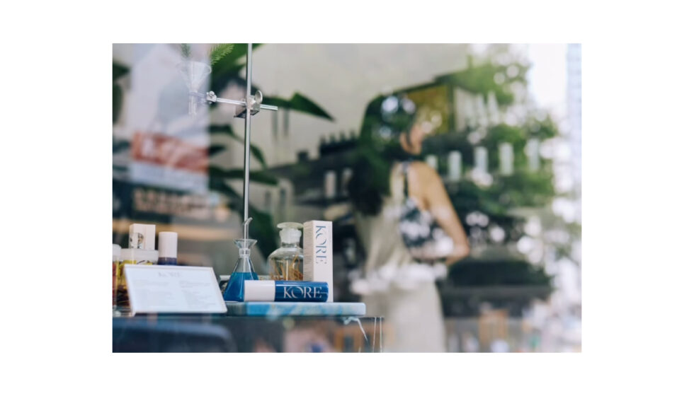
Brand identity and packaging for KORE, a luxury, innovative brand and product line of hair and scalp healthcare solutions.
Creative Approach
At the heart of the brand stands a philosophy of blending traditional Chinese medicine concepts with top-class biotechnological techniques to revolutionise haircare practices.
The English word core—essential, at the heart of—interestingly forms part of the word ‘cortex’: the main component of the hair, forming 90% of its weight and containing most of its pigments. KORE’s philosophy and this principle of ‘centrality’ formed the basis of our explorations.
We researched traditional Chinese medicine ephemera—from antique porcelain jars and folded envelopes used to store and wrap medicinal herbs, to notices, prescriptions, labels, stamps and calligraphy. We dusted off and revisited these visual references, fully integrating them into a realm of sophistication and precision evoking R&D practices and next-generation technology involved in modern cosmetics innovation.
Creative Outcome
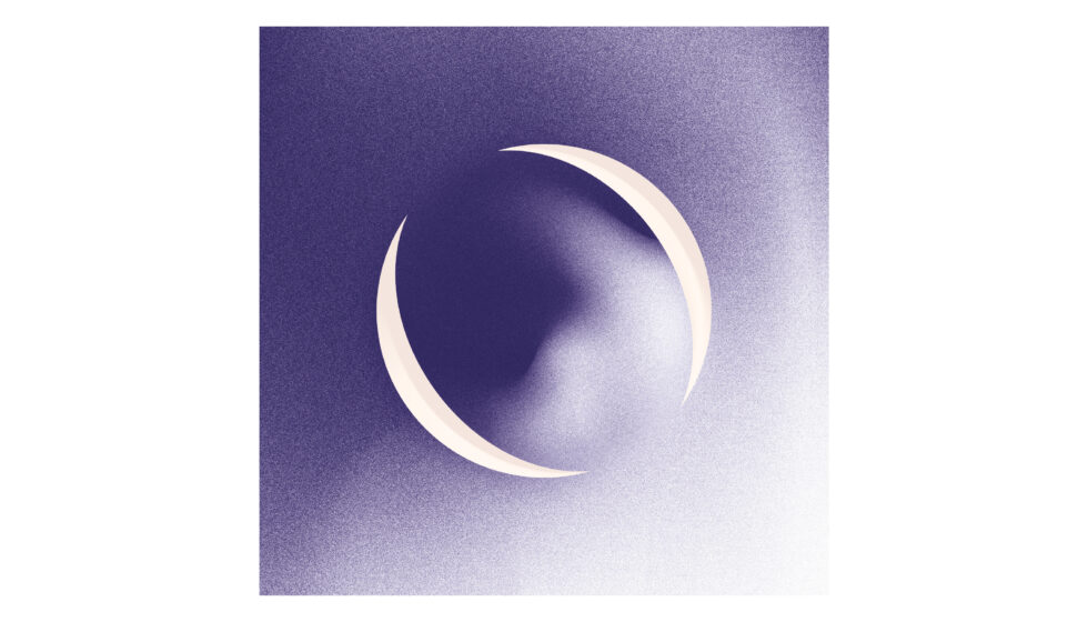
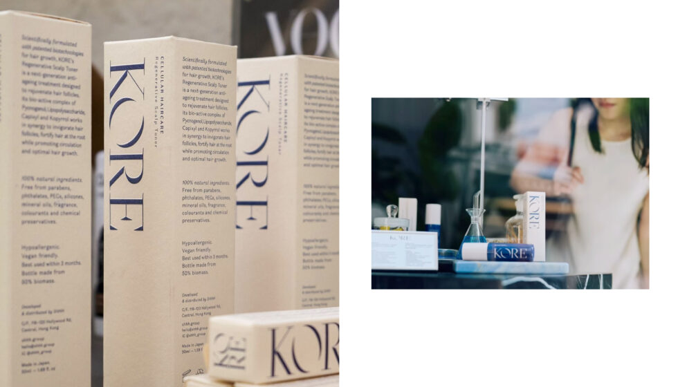
The sharp-looking logotype, with elegant contrast and a stylised yin-yang like ”O”; the duo-tone of deep China blue and soft pink off-white; the cleancut layouts with varying type alignments and intricate patterns applied to innovative bespoke packaging—each element of KORE’s visual identity is subtly inspired by traditional Chinese medicine to encompass concepts of balanced duality with emanations of craft and scientific precision.
Hyper Potential
After launching four products (a scalp toner, a lash & brow serum, scalp ampoules and skin ampoules) KORE achieved international recognition and was awarded “Best Luxury Haircare Brand” at the Vogue Beauty Awards.
KORE’s range of products is available for purchase at some of Hong Kong’s finest hair salons and at the luxury and iconic department store Lane Crawford.
Visit the Shhh Salon website to know more about KORE