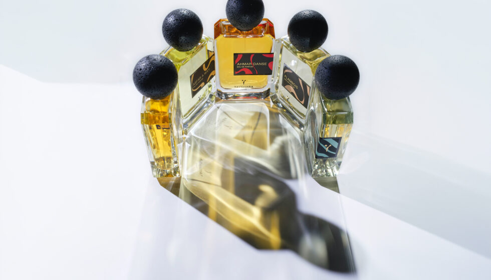
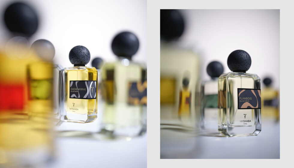
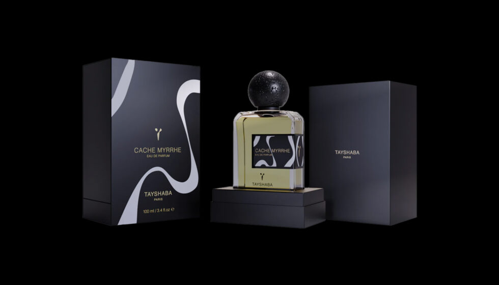
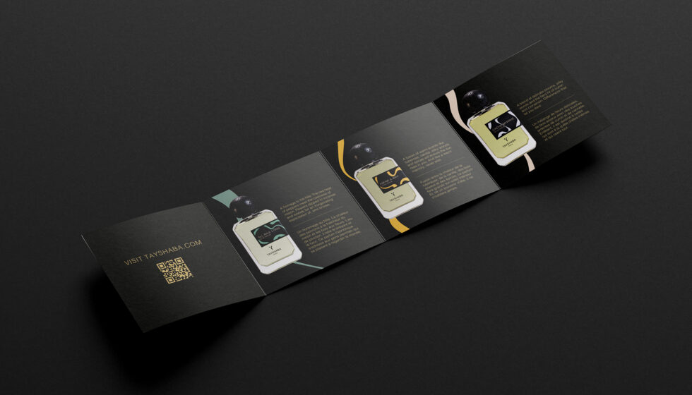
Brand identity and packaging for Tayshaba, a perfume brand and its first collection of niche perfumes, created by the world’s first Franco-Sudanese perfumer.
Creative Approach
The name “Tayshaba” is a combination of “Taïsha” and “Aba”; the first being an ancestral Sudanese tribe, the second, the island where the first battle for
Sudan’s independence took place.
This word contraction formed the ground for us to create a visual identity system that celebrates and champions strong themes: independence, heritage, empowerment, harmony and diversity.
Creative Outcome
The Y emblem pairs Aba Island’s topography with the “Ï” from the original tribal spelling of “TaÏsha”.
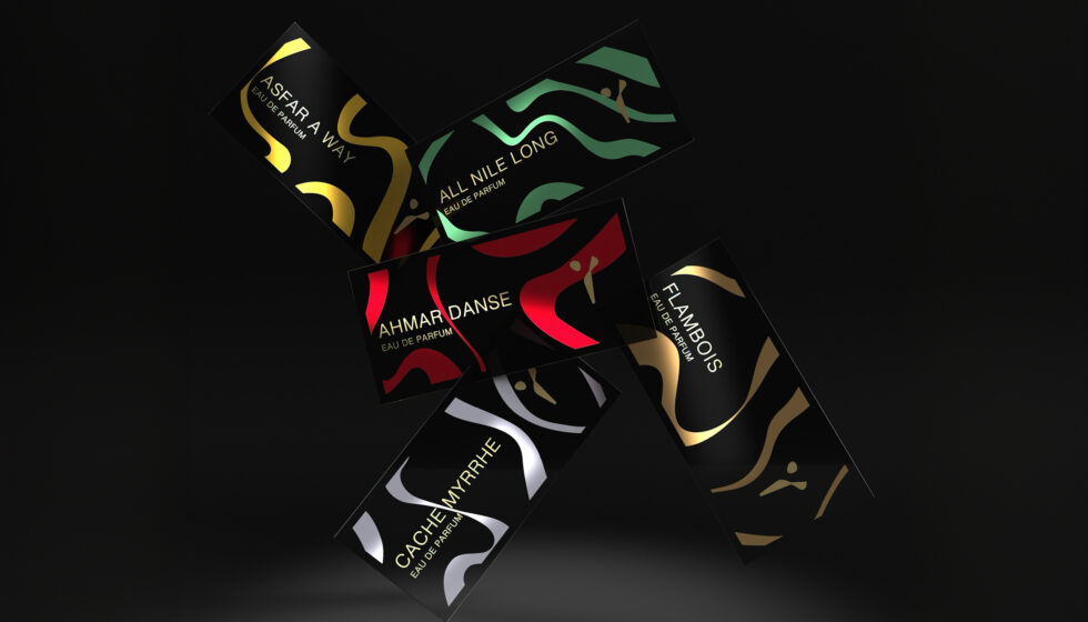
Each perfume in the first collection has a signature
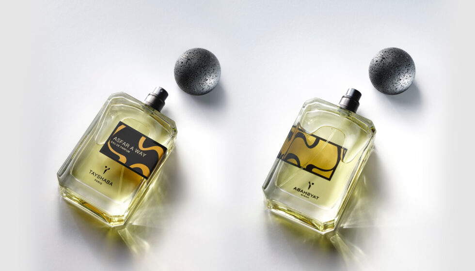
wave and colour. The waves, abstract ink-drawings of the curves of the Nile, are reversed out on the insides and backs of each bottle label. The colours
are strong symbols. The red of toubs (bridal tunics), the blue from where the White and Blue Nile waters meet, the sandy and golden ambers of the desert and the hot sun, the gold of traditional jewellery.
The whole identity embraces the personal, rich historical and cultural background of Maiada, with a diversity and twist which reflects her subversive approach to Life, Art
and Creation.
Hyper Potential
Tayshaba is available at high-end stores such as Jovoy in Paris, 15 West in Berlin, Roullier White in London and Niche Fragrances in Cork.
It has been featured in the specialised press; Le Monde, Marie Claire, Essencional and Fragantica,and part of an episode on French podcast La Parfumerie.
It was awarded Best Emerging Brand at the 2023 Ball Trap Awards and its perfume Cache Myrrhe was featured in ÇaFleureBon’s Top Ten Perfumes of 2024.
Perfume bottles photography by Cedric Porchez.